Old or new, maps are cool.

Can you ever have too many maps?
The obvious answer is no. You can never have too many maps.
So when I ran across some very cool old maps last Saturday at the Wichita Flea Market, there really wasn’t any question about whether or not I would buy them. The question was how many will I buy.
I settled on two. Which means my wife helped me decide that I should settle on two. There are quite a few maps already in my house and I was gently made aware of that fact. Which means semi-gently.
Both of the maps I walked away with are almost 100 years old. One is a 1924 map of tourist Rome published in Italian, the other a map highlighting the 1924 British Empire Exhibition with suggested mass transit options from around the London metro area. So cool.
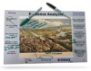
Perfect for displaying, reading, primary source analysis, (the Empire Exhibition and its various colonial pavilions is just asking for some in-depth conversation) or just wafting in the 100 year old smell.
But while we all can agree how cool old maps are, new maps are nothing to sneeze at. I love the ability of digitized maps to allow access to all sorts of data in all sorts of very visual ways. Take a look at these two new atlases from the Digital Scholarship Lab at the University of Richmond.
The first collection of digital maps, the Atlas of the Historical Geography of the United States, is based on an atlas that was original created in 1932 by Charles O. Paullin and John K. Wright. Many of those beautiful maps have been enhanced:
. . . in ways impossible in print, animated to show change over time or made clickable to view the underlying data – remarkable maps produced eight decades ago with the functionality of the twenty-first century.

Like the original, there are 14 different chapters and almost 700 maps. All based on older maps but digitized and edited to make them more accessible and richer in content. And like the original, the atlas addresses a broad range of issues.
Beginning with a chapter consisting of 33 maps on the natural environment and a second containing 47 maps documenting the evolution of European and later American cartographic knowledge about North America, the atlas mapped an exhaustive number of historical topics: exploration and settlement of the continent, the location of colleges and churches, disputes over international and state boundaries, voting in presidential elections and in Congress, reforms from women’s suffrage to workmen’s compensation, transportation, industries, agriculture, commerce, the distribution of wealth, and military history.
For twenty-first-century audiences, it’s probably no surprise that it’s missing a few things as an historical atlas. Besides the fact that it’s now more than eighty years out of date, it is primarily focused on Americans of European descent – though, to be fair, it certainly contains a significant number of maps showing the geographic distribution of people of different ethnic and racial backgrounds. Yet whatever the atlas’s shortcomings, browsing through its many thoughtful and often beautiful maps one can’t help but be impressed. Anyone interested in American history before 1930 is almost certain to find many maps in the atlas that are both interesting and useful.
So if you’re teaching any US history, the newly updated digital version is a no-brainer. Head to the About page to jump start your time in the Altas.
But wait. There’s more the people at Digital Scholarship Lab weren’t finished. They’ve also created American Panorama, an historical atlas of the United States for the twenty-first century. “It combines cutting-edge research with innovative interactive mapping techniques, designed to appeal to anyone with an interest in American history or a love of maps.”
So . . . I’m listening.
It’s a smaller collection of just eight maps so far but the maps move closer to the present, with one map focusing on electing the House of Representatives from 1840 – 2016 and another on America’s foreign-born population up to 2010, for example.
But all of the maps give you tools to help kids actually see history and begin to make sense of events in ways that simple text cannot. The Mapping Inequality map that highlights the redlining of home loans by the Home Owners Loan Corporation during the 1930s and 40s is a powerful way to jumpstart and deepen a conversation around civil rights and racism in the US.

Used together, these two updated versions of cool old maps like the ones I uncovered at the flea market give you powerful tools to hang on your teaching tool belt.
(And don’t forget to use the Library of Congress and National Archives map analysis worksheets to help kids unpack all the goodness.)


Hello! Thank you very much for sharing these atlas links! As with most maps (digital or physical), I fell down a rabbit hole looking through them and taking in what I could. Maps are a natural addition to any social studies room for aesthetic or informational purposes, but digitized resources should not be overlooked. The atlas you have linked, the Atlas of the Historical Geography of the United States, is a fantastic resource that is made all the more meaningful by its use of the same map with different informational overlays that you can select. Having all this information present in one place makes for a helpful resource. Maps should help us and our students to see how small the world really is and how connected we are.
I love maps! And this is one of my favorites. So I’m glad that’s it’s now part of your teaching toolkit! Thanks for the quick comment – I appreciate it.
glennw
Thank you for sharing these links! Ever since I was a kid I was fascinated with map. I remember the first map I bought was in 4th grade on a school field trip to Mackinaw City. The map I purchased was a British map of northern Michigan. I thought it was so interesting because the shape of Michigan was wrong and it made me question so many things behind the making and the rendition of it. I think we do not use maps enough in classrooms when they are one of the oldest and most useful tools we have in social studies.
Zach, I couldn’t agree more! Maps can be integrated into instruction in so many ways.
Be sure to check out some of my other map related posts at:
https://historytech.wordpress.com/category/maps/
glennw