Throwback Thursday: “Can the Chronicling America primary source newspaper site get any better? Yes. Yes, it can.”
I’m spending a few days with some of the amazing staff at the Library of Congress (I’m looking at you, Cheryl), learning more about their super cool primary sources and more ways to use them. Yesterday I had a bit of chit-chat with the people in the LOC Newspaper Division that included some tips about using their awesome Chronicling America digital newspaper site.
It was exactly one year ago, I posted some details about one of the site’s best new features. It seems appropriate to give that post another look-see. So . . . today? A Throwback Thursday History Tech edition.
————————
Seriously. Other than somehow delivering their results with a large iced tea and delicious side order of hand-cut fries, is there any way that the Library of Congress Chronicling America site could get any better?
I mean, you’ve got almost 200 years worth of digitized primary source newspapers available for scanning, analyzing, printing, and perfect for use for all sorts of learning activities in your classroom. OCT text versions of articles. Searchable by keyword. By language. By state. And it’s free. What’s not to like?
So is there really any way that it could get better? Yes. Yes, it can.
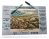
Adding a map with an embedded timeline would make it better. So . . . that’s what the LOC people did. You now can search for newspapers by location and time visually using their new interactive map. So cool.
You and your students can now browse the collection’s thousands of digitized historical newspapers using the interactive map and timeline recently launched by the Library of Congress. The new “Exploring Chronicling America Newspapers” application dynamically maps publication locations of over 3,000 digitized newspapers currently available in the Chronicling America collection. Using the Esri ArcGIS Instant Apps platform, Chronicling America staff are able to update the map and timeline every week to include the latest additions to the collection. (And if you’re feeling especially nerdy, fee free to download the updated map dataset to create your own custom data visualizations or analyses.
Find the map by clicking the sidebar link on the Chronicling America site:

You’ll see a list of map options. The first link provides the generic map but be sure to explore the other options as well.

Using the Map and Timeline
The new interactive map and timeline uses the ArcGIS Instant Apps web mapping platform to build upon the foundation of the earlier Chronicling America data visualizations and the experience of the Library’s use of Story Maps. The power of the map tool is particularly useful when you or your student know the approximate date range and geographic area they want to research but don’t know the extent of coverage available for digitized newspapers available in Chronicling America. The map’s zoom controls will reveal additional details such as county and city names. Clicking on a dot to see the details about a newspaper and follow the links to view digitized issues in Chronicling America. In specific areas with multiple newspaper publications, these dots will typically appear clustered around a specific city center.

Access the timeline feature by clicking the clock icon in the lower left-hand corner of the map. The dates in this time slider represent publication dates for digitized newspapers available in Chronicling America. Simply adjust the slider to narrow the date range of newspaper publications included on the currently displayed dynamic map.
So . . . while it’s not that order of iced tea and golden french fries that we started with, an interactive map with timeline is still pretty sweet. And I’m absolutely okay with that.